
"5 years ago, I had an idea for a piece of artwork that would tell our story as a family business. This year, that dream became a reality thanks to the amazing talent of Chern'ee Sutton.
I wanted the artwork to honour Mum & Dad's legacy, to say thank you, and to be a constant reminder of who we are and what we do so well, whilst also remembering where we came from.
Chern'ee is a remarkable young woman, a phenomenal artist and will forever be a member of our Spaceframe family.
Happy Birthday Spaceframe! Here's to many more."
-- Jane Raspotnik (Joint Managing Director)
SpaceFrame
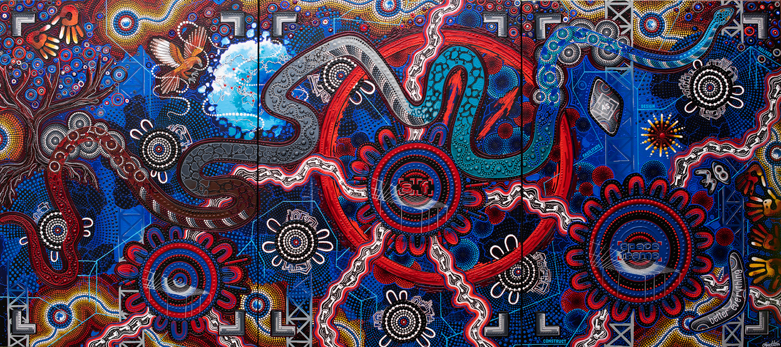
My name is Chern'ee Sutton and I am a contemporary Indigenous artist from the Kalkadoon people from Mount Isa in Queensland. This painting is called SpaceFrame and it represents the companies journey "From Modest Beginnings to International Success." The 3 large red and blue Community symbols on each of the panels represents Spaceframes development and journey throughout the last 38 years, from the Left, the company starts off small, building rural sheds with the 2 sets of footprints symbolising Werner and Christine starting the company, they are then shown as part of the Spaceframe Community Symbol represented by the 2 U Symbols (People Symbols) with the coolamon and digging sticks and the spears.
In the next Panel the company grows, building much larger structures and buildings, All members of the Raspotnik family are now a part of Spaceframe, Christine, Werner, Peter, Jane and Lisel's footprints lead to and from the Company. They Then lead to the final panel where Spaceframe has grown into the award winning company that it is today, specialising in design and construction in a range of industry sectors and a pioneer of the design and construct model in Australia. Werner, Peter, Jane and Lisel's footprints lead to and from the Spaceframe Community Symbol.
In the first panel the 2 handprints represent Werner and Christine's connection to Spaceframe, with the tree symbolisng the growth of the company with the roots representing a strong foundation and the leaves representing the 220 employees, some of whom have been a part of the Spaceframe family since the beginning, these are the staff who surround Werner and Christine's handprints, others have joined the team more recently which are further along the paintings. The eagle symbolises Werner flying around the world for his company, with the red dots showing the many Countries that Spaceframe has built projects for in the past. Now working primarily in Australia Spaceframe still continues to exceed all expectations on every project they create.
The 8 blue, brown and red dotted circles in the background of the 3 paintings represents the 8 Australian Sates and Territories that Spaceframe works within, continuing to "build a reputation for delivering beyond traditional limitations to offer a new standard in commercial and industrial construction."
The 7 smaller white, grey and blue community symbols with the U symbols and building structures around them represent the industry sectors and projects that Spaceframe specialises in including Warehouses, Factories, Cold Stores, Food processing facilities, Retail and Commercial Developments, mining infrastructure and Spaceframes community work.
The light blue lines throughout the painting and the dark blue and grey building structures in the background symbolises how the Spaceframe team delivers all components of a project, from design, through to construction and completion. With the words Facilitate, Design, Construct and Deliver showing the steps which makes up this process.
The rainbow serpent throughout the painting represents Indigenous Culture and history and pays tribute to the Traditional owners of the Brisbane region, the Turrbal and Yugara people. It also represents the Brisbane river, and the home of Spaceframe. Even as the company has moved and grown, it has continued to call the Brisbane region home.
The large red clock on the second and third panels symbolises "The Spaceframe Way" This fast and holistic approach enables the delivery of projects in quicker timeframes, cutting up to 40% off the overall completion time which allows more time to focus on the quality of the build, delivering better designs and outcomes. This results in 100% of projects being delivered ahead of time.
In the final panel The shield represents Spaceframes AllSafe safety initiative which is at the heart of every Spaceframe project. Like the shield it protects the health and safety of its bearer, the Spaceframe family, Staff and community. With the boomerang representing Spaceframes goal to achieve "Better Everything" which is why national and international companies, clients and customers continue to return to such a reputable company.
The 38 (boomerangs and shield) is the number of years that the Raspotnik family has been a part of the company and finally the 4 handprints along the side represent Werner, Peter, Jane and Lisel's connection to Spaceframe today, with the star symbolising Christine, who is still watching from above.
By Chern'ee Sutton
Age - 23 years
Size - 3 panels @ 91cm wide X 121cm high each panel
Medium - Acrylic and textured acrylic on canvas
To download Chern'ee's composition breakdown, click here.
Back to all articles Share on LinkedIn Share on Twitter Share on Facebook Share on Pinterest